CDL fosters the next generation of Canadian tech startups, giving founders practical experience working with world-class investors and entrepreneurs.

Creative Destruction Lab (CDL) is a nonprofit organization that delivers an objectives-based program for massively scalable, seed-stage, science- and technology-based companies.

CDL’s Super Session event is the annual showcase for the graduating companies, bringing together a global community of founders, mentors, investors, and thought leaders for two days.

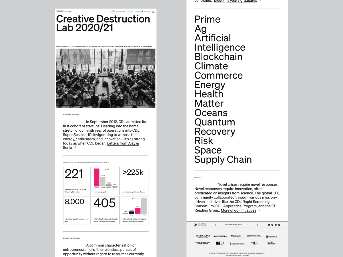
To mark the accomplishments of each year’s graduating cohort, an extensive catalogue — Year in Review — was published and distributed at the event. However, due to the global pandemic the annual catalogue had been re-envisioned as a microsite in 2021.

As 2022 marked a decade in the program’s existence, we initially approached the project as a timeline celebration. However through discovery we learned the client wanted to build on the existing structure, so we focused on evolving the UX/UI.
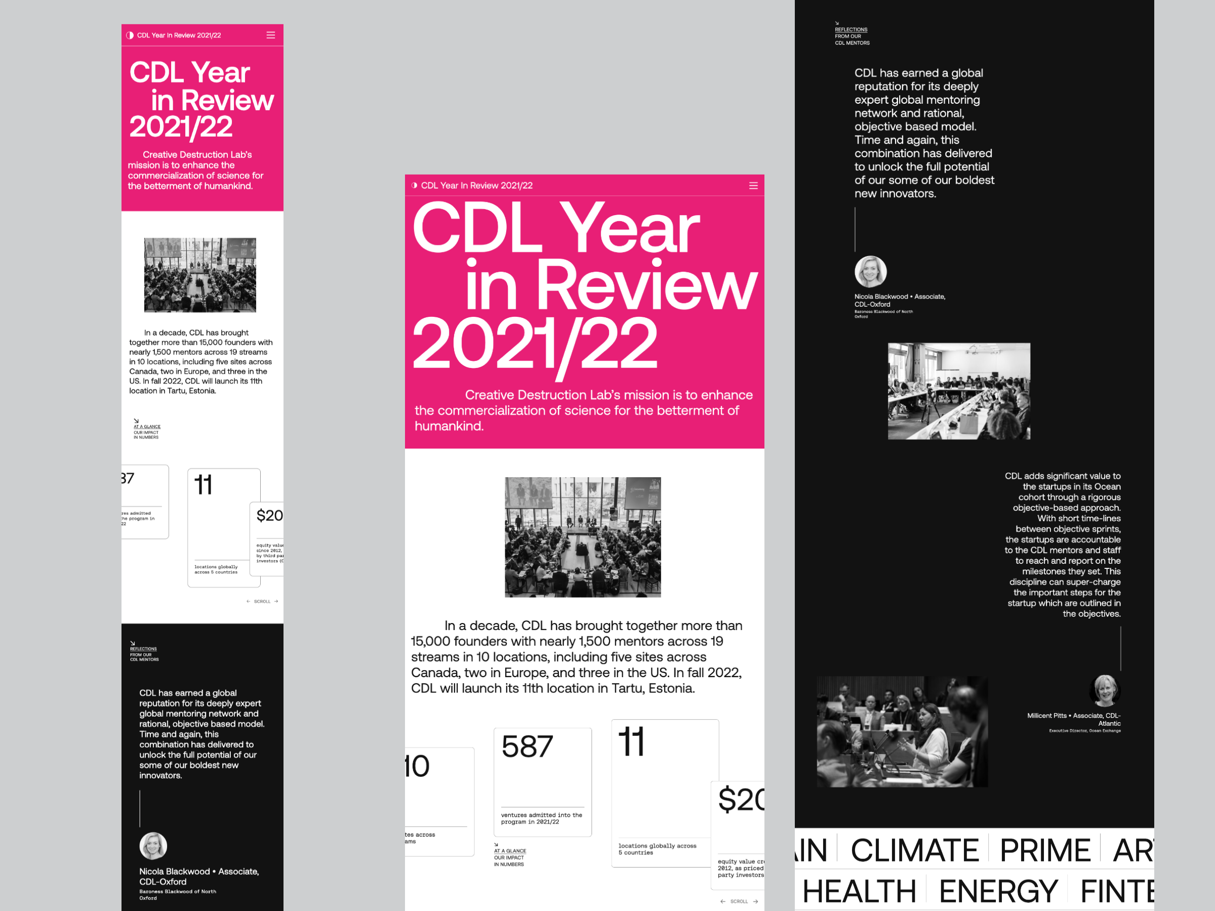
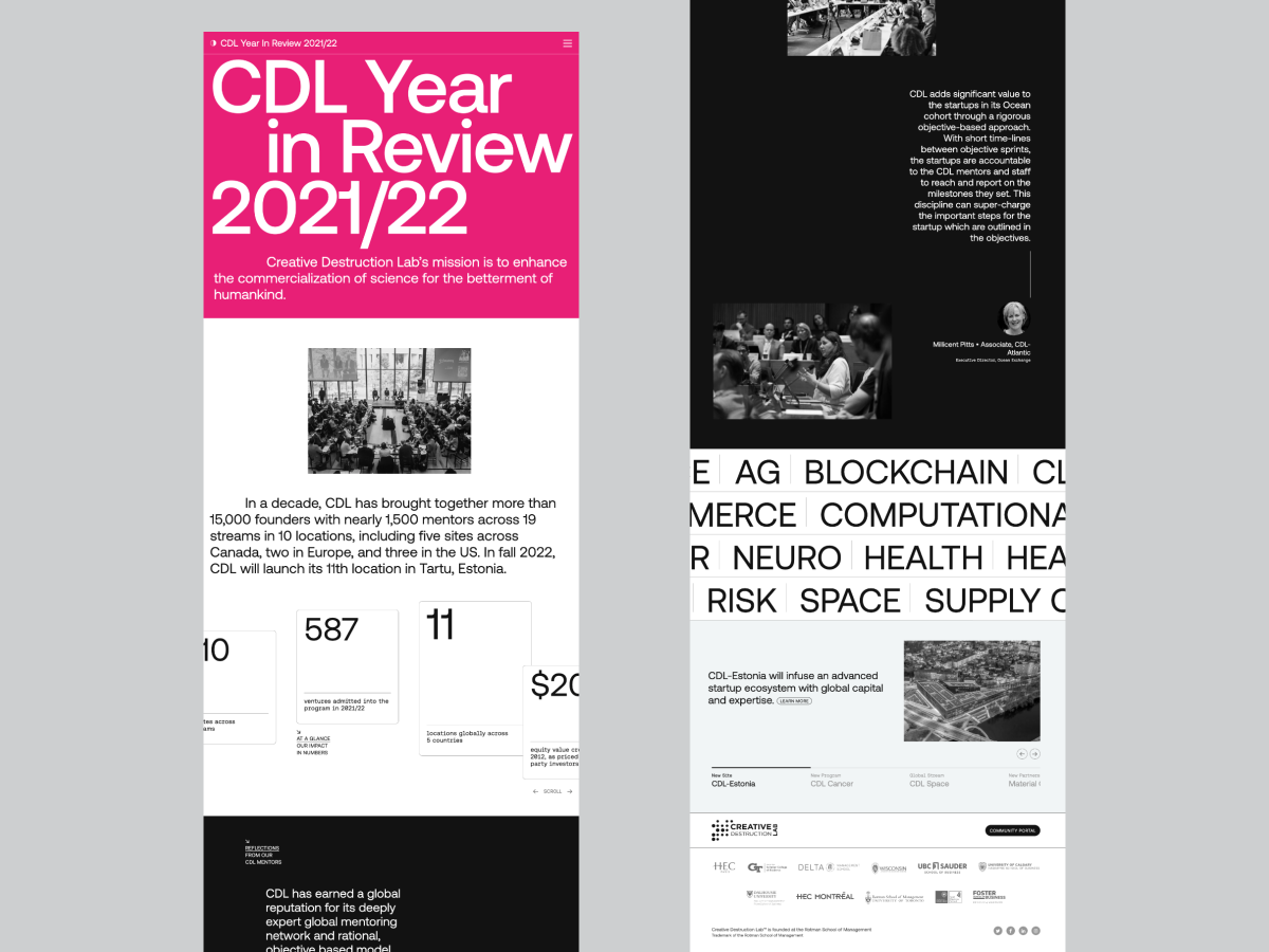
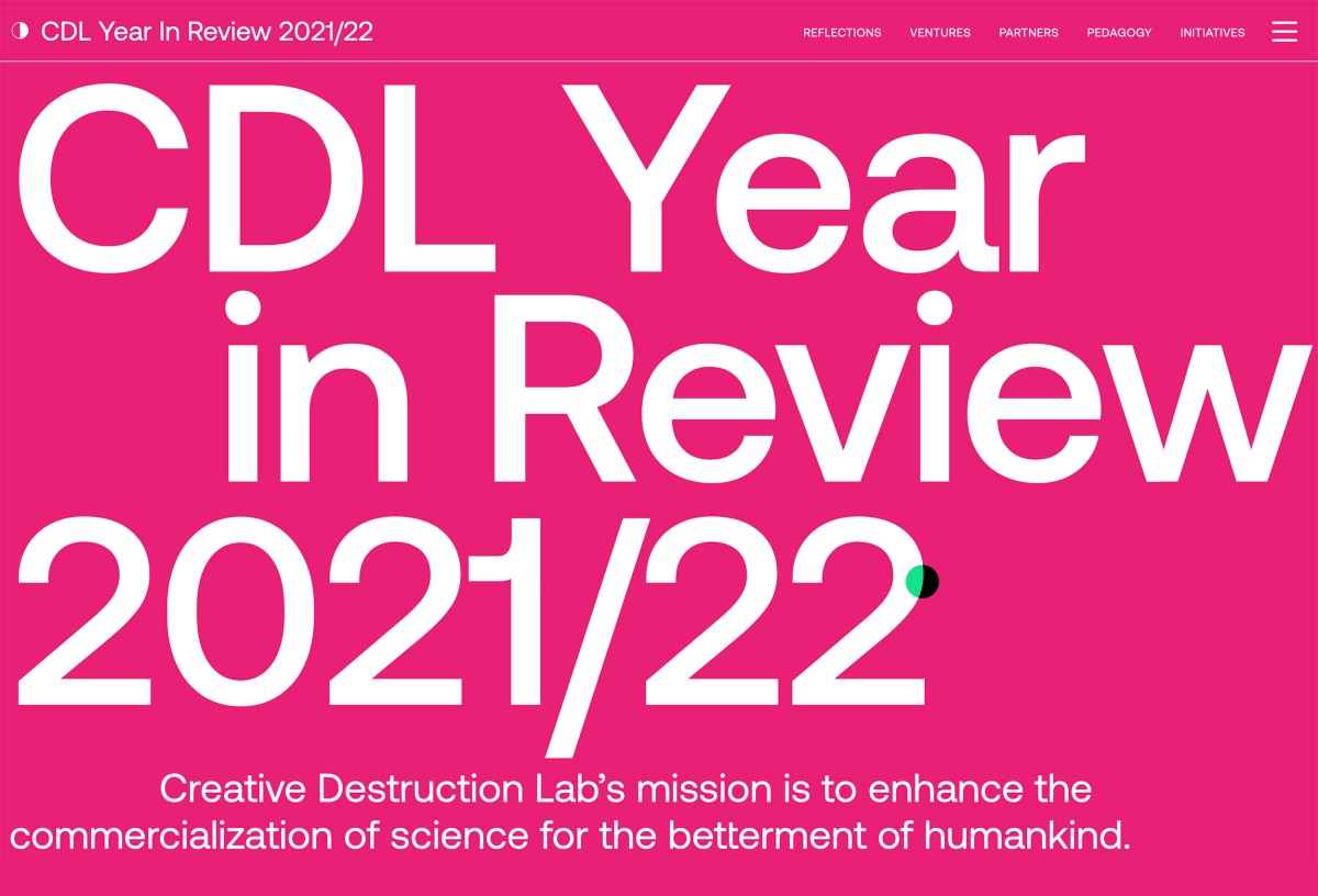
Introduced a bold typographic treatment for the lading page that leverages a low-payload CSS animation without sacrificing visual impact.

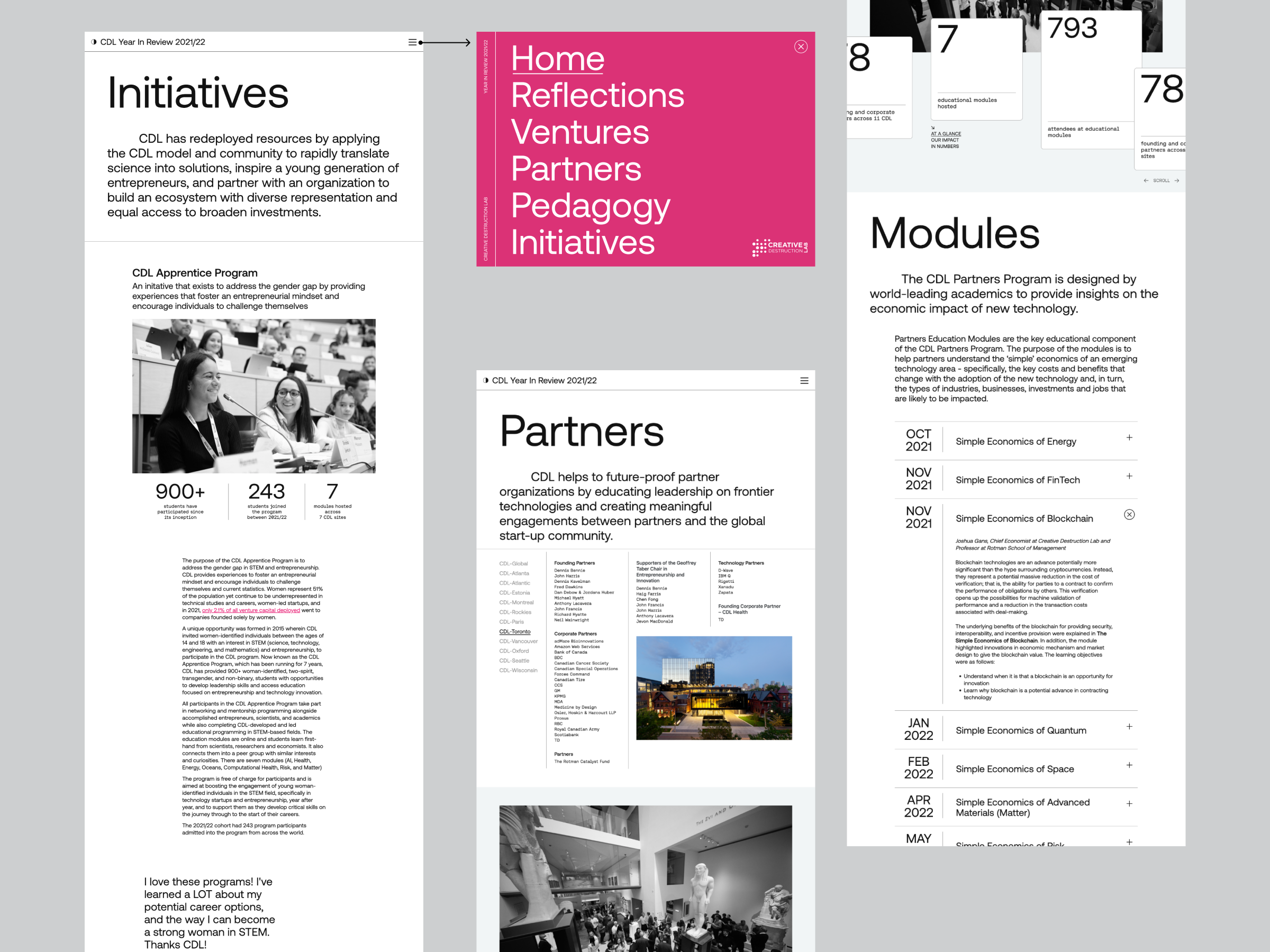
Redesigned the light/dark toggle to occupy less space, making room for the website name in the header. Introduced in-page navigation to help the user navigate the long-form content.

Integrated different types of sliders (scrolling, ticker, etc) to help layer information and reduce cognitive load for the user and provide multiple entry points into the content.

Aiming for an evolution, I approached the project by examining the past. Looking at the legacy of the printed book next to the microsite, it became apparent there was a disconnect between the boldness of the editorial spreads and some of the interactive solutions.

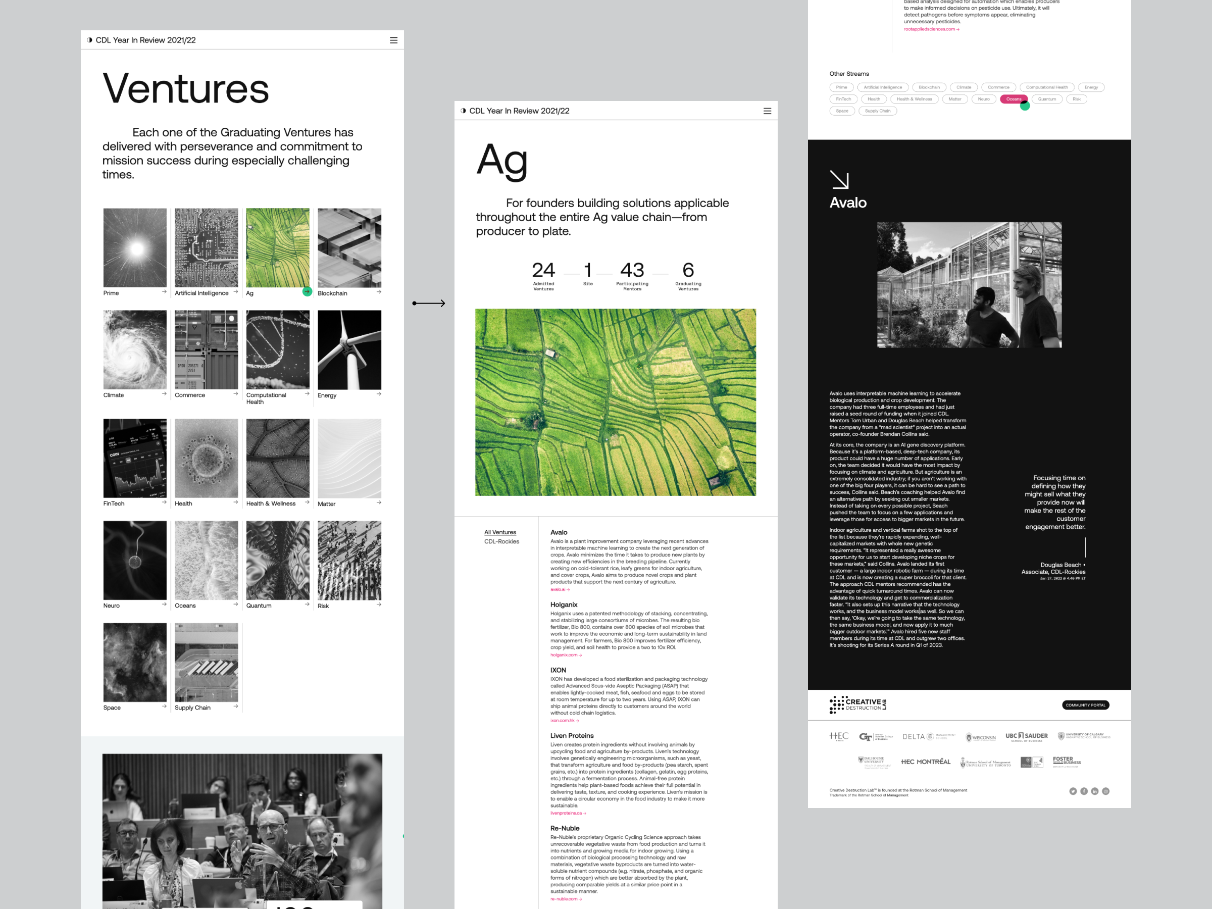
I decided to re-introduce some of the visually impactful editorial elements from the book — oversized quotes, edited stats, colour blocking, and overlapping photos. To bring new energy into the website we chose a new sans-serif font with a more scientific vibe and personality.

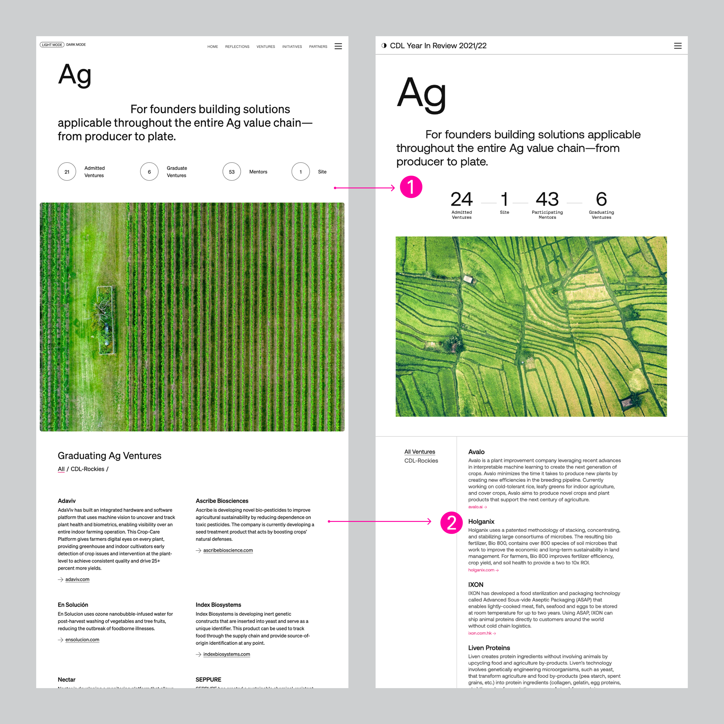
➊ The header hierarchy was refreshed with a bolder typography and the cover image was scaled down for a less overwhelming effect.

➋ The multi-column layout was reduced to a single column for an optimal web reading experience, adhering to optimal line length for web.

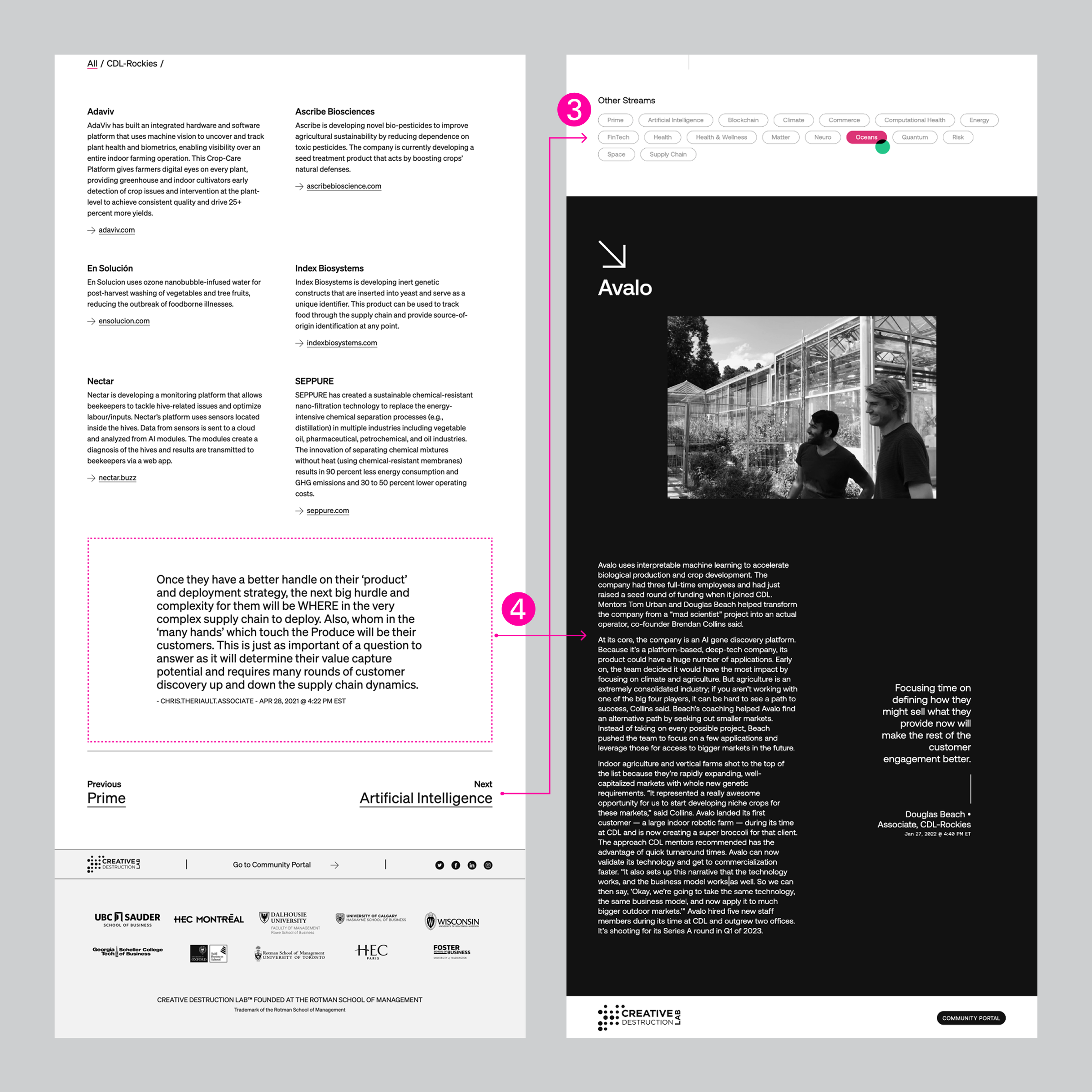
➌  To improve discovery across sections, the Sequential Nav at the bottom was moved up in the page and was replaced with a Pill Nav.

➍ Additional context was added to the quote block, by expanding it into a mini case-study that highlighed one venture per stream.

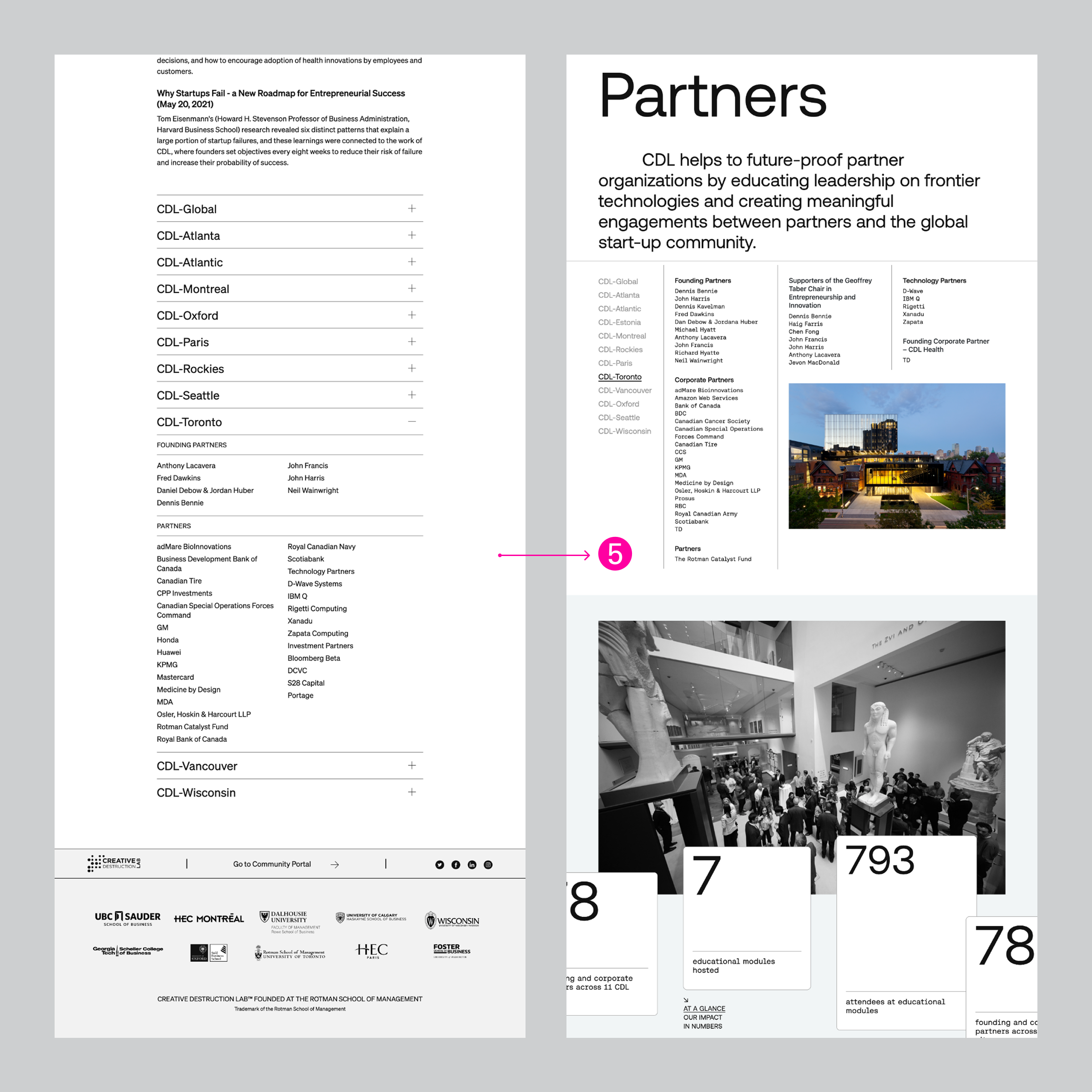
➎ The content was strategically reorganized across several pages, clearly defining sections for a better user journey.

For example under Partners the content was presented under clear headings, and the emphasis was reprioritized — the Partners section (moved up), and the content for Modules was condensed into secondary collapsible drawers.

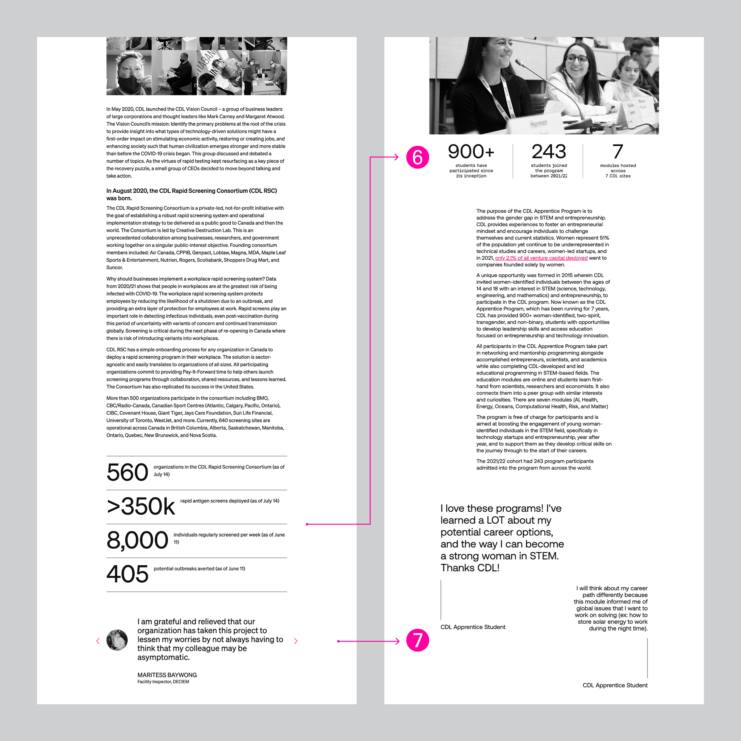
➏ Due to the long-form nature of some pages, the content needed optimization. Content modules were restructured to provide the key information upfront and reduce user fatigue — for example under Intiatives the impact block was integrated as part of the summary.

➐ The testimonials-like slider was swapped for a visually impactful block, giving the user a break from the content.

Studio of Record
Studio Wyse
Creative Direction
Vanessa Wyse
My Role
Senior Designer / Project Lead
Development
Nicole Tseronakis / Digital Rise Studio